About Me

- Amber
- The Apple State, United States
- Visit me at ambermcleod.com where I display my wares...
Where to put the good stuff!
This is a tidbit of information that I learned in my high school speech class - and retained it! This, and the Pythagorean theorem! (I made that clickable for those of you who must know!)
I owe thanks to Mr. Alan Skoog, my teacher at the time. Cool guy, funny, great FFA advisor. That aside...in speech class he taught us that in advertising, the tag lines that really pull you in are placed strategically. Yes, there are certain areas on a page, or in this case, a website, that draw the eye FIRST.
Four letters: C, N, S & Z. Imagine for a moment that there is a giant letter (one of the four, of course...see below) on your page (or site). Here's your visual:
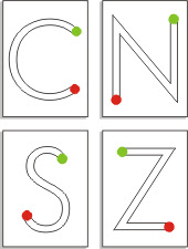 ...okay, starting at the green point and following to the red. These are all natural movements of the human eye. So, in relation to your page or site, your tag line - the phrase that pulls your visitors in - should be placed on a green dot. So many people stick it right in the center -- it seems logical for things to be centered, but not to our brains!
I can't say I always follow this rule, but I do find that I really prefer the "Z" formation. Right brained, I guess. And really, a website just needs to be aesthetically pleasing to everyone...and I'll follow that over letter formations. But interesting, nonetheless!
So, there you have it. One more interesting tidbit from mois!
How do I make a banner??
So, so, SO many people ask "how can I create my own banner to promote my business?"
My answer is easy. Just buy them from me! But if you're dead-set on making your own, let me help!
Here are some sites that help you build one online - I've rated them (not in order). There aren't a LOT on this list, but it's a place to start! If you have some good ones, comment me!

˜˜˜˜˜
BannerBreak.com
http://www.bannerbreak.com/
Cons: The color picker pop-up was a dead link. Not so helpful! You'd have to know your HEX colors or look them up elsewhere.
 ˜˜
˜˜
BannerCreator.nu
http://www.bannercreator.nu/banner-maker.html
Pros: Lots of options.
Cons: It was extremely difficult to figure out what setting did what. I had a hard time making a decent banner so the one above is the one generated by their default settings.

˜˜˜
MyBannerMaker.com
http://www.mybannermaker.com/
Pros: Extra effects to choose from. Provides source code and image hosting for link-exchanges. Overall a decent service!
Cons: Lots of settings. You really need to take some time to tinker with things to get exactly what you want. Not for those who need instant gratification. Banner also displays the MBB logo.
˜˜˜
123-Banner
http://www.123-banner.com/
Pros: Provides flash animation banner. Lots of options. Easy to use
Cons: Not everyone accepts flash. I can't even upload it here. It displays their logo on the bottom.
So overall there ARE some options, but for a few bucks you can get something nice. And custom. And fancy schmancy. Check out my portfolio and see whatcha think. And the prices are so amazing you may just fall right over in your chair from the sheer excitement of it all.